Misc. Logos
This page contains a small selection of logos I designed for various brands/companies in the past couple of years.
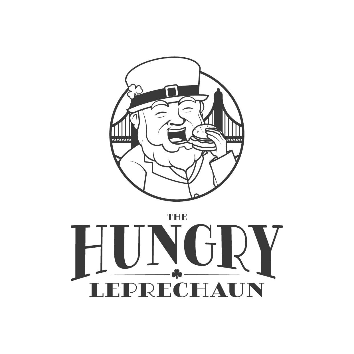

The Hungry Leprechaun is a popular Irish themed food truck in San Francisco, run by a Galway man and his partner.

An Gabhair Dall means ‘the blind goat’. Given their ability in traversing the steep limestone crags of the Burren landscape it’s a perfect mascot for a rock climbing club based in this part of Co. Clare
SOS Ice is one of Ireland’s biggest commercial Ice suppliers (but interestingly have also found a new niche in supplying ice for ice baths). They offer the slogan ‘Great Ice, No Fuss’, and the logo reflects this, each letter housed in a square ‘ice-cube’, with a morse code translation of the name separating the two words of the mark.

Lumi is a seaside bakery in Duncannon, Co. Wexford. Lumi means ‘lemon’ in Maltese (where one of the owners, Matteo, hails from), so the brand mark has a lemon sun rising above the waters of Duncannon bay, which is indicated by the two headlands framing the water.

Off the Beaten Truck is a food truck that first started it’s life in Crone Woods, a popular spot in the Wicklow Mountains that offers great view of Powerscourt waterfall. It a necessary pit stop for hikers and mountain bikers, before relocating to coastal Galway to instead cater for holiday makers and swimmers.
The logo sets the scene in which OTBT was first set, with the truck itself deviating from the pictured path and also the bounds of the logo’s container.

The mission of the Tunney Song Tradition Trust is to promote and maintain the life’s work of Paddy Tunney, singer, writer and storyteller.
The Janus figure of the logo mark is based on a statue very close to where Paddy grew up in Fermanagh, and given that it’s dual faces are meant to represent looking simultaneously to the past and the future it’s an appropriate piece of imagery for the Trust.

Homestead Cottage is a gourmet restaurant tucked away not far from the Cliffs of Moher, in a beautiful spot overlooking Galway Bay. Serving modern dishes with a strong focus on locally sourced ingredients the restaurant draws visitors from all over, and was even awarded a Michelin star in 2024!
A hand drawn style mark was fitting for the friendly and cottage-y vibe of this restaurant, some local flora flank the cottage, with a couple of happy looking critters hanging out as well. A plume of smoke rising from the chimney to suggests a cosy and inviting interior.

Rúnda, which means ‘secret’ in Irish, is a coffee shop that was originally a hidden gem tucked away in a car pack behind some other business in the seaside Gaeltacht village of Spiddal, Co. Galway.
The brand mark is a simple one, a sun rising over the sea, housed inside a minimal coffee cup shape.

‘Tearmann’, meaning ‘sanctuary’ is the root of the name of this knife making business, based in Termon, Co. Cavan. The shape of this mark echoes that meaning, arching up to a point that is reminiscent of a church, the texture of this shape a nod to the hand built stone walls found across Ireland. A flame sits at the heart of this shape to represent both the fire needed to shape metal, and the fire at the heart of a safe sanctuary.